Why I keep thinking about video games when we build news sites (Blame GTA VI)

Everyone around me has been talking about Grand Theft Auto VI landing on November 19, 2026. Somewhere in that conversation I found myself thinking less about the game and more about our clients, which is probably a sign I need a hobby outside of work. Still, the comparison held up better than I expected once I actually sat with it for a while.
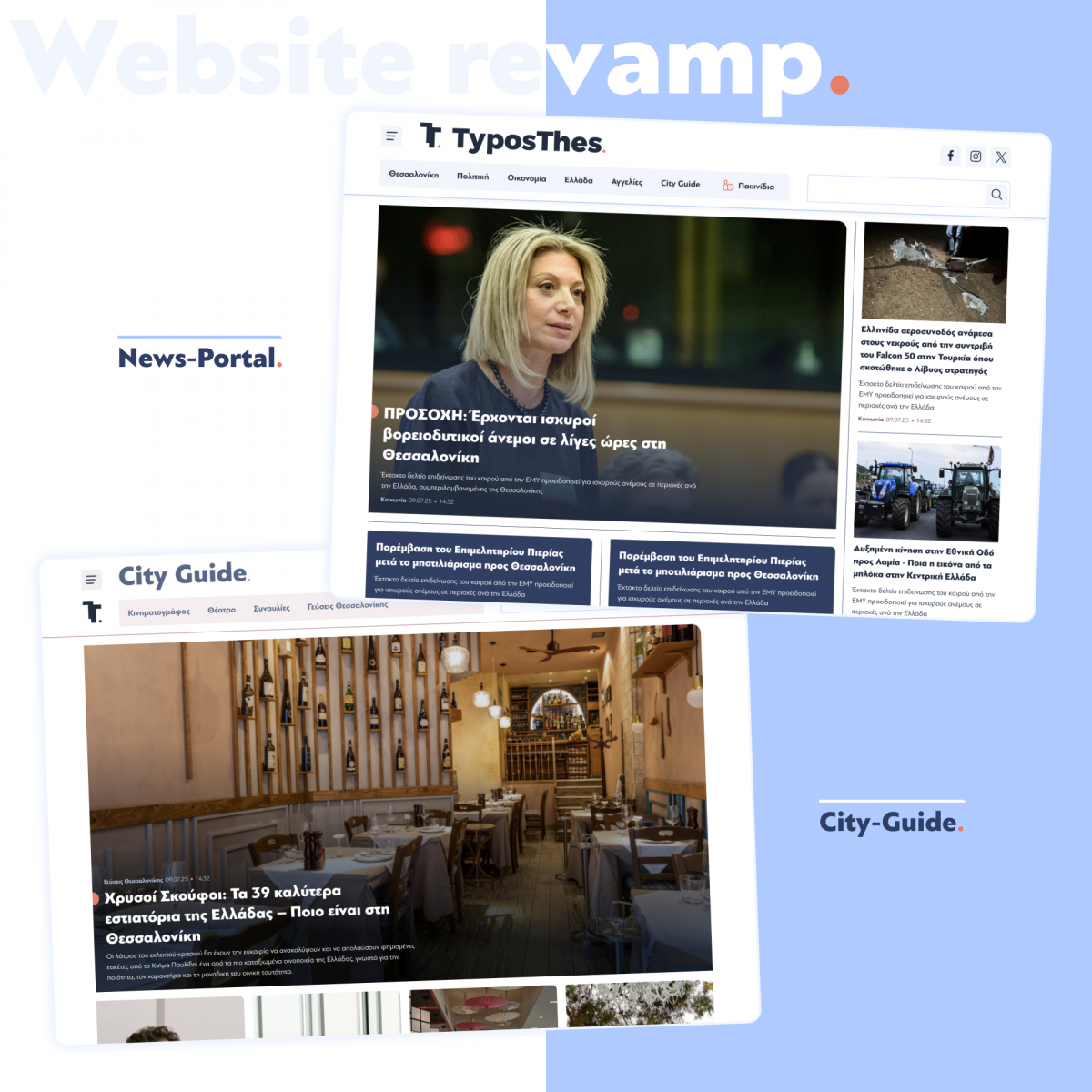
Most of what we build at Pixual are news and media sites. The kind of page a stranger lands on for thirty seconds after clicking a headline on Facebook. The kind an editor has to update six times before lunch on a day when something actually happens. Game studios have spent a couple of decades getting good at a problem that looks almost identical: someone shows up with zero context and no patience, and you have to get them oriented before they leave. Rockstar pushed GTA VI's launch back a second time, saying the extra months were needed "to finish the game with the level of polish you have come to expect and deserve." Read generously, that's more or less the same instinct behind what the games industry calls the first-time user experience, or FTUE: the opening stretch that decides whether a player sticks around. A news site is running the same calculation, just on a much shorter clock. There's no marketing budget standing between a bad first impression and someone closing the tab.
Two different people to win over
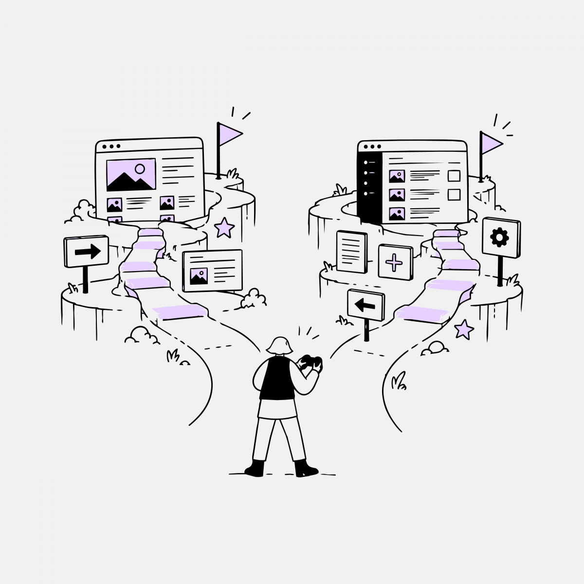
What made the comparison click for me is fairly specific to the sites we actually build, not onboarding in general. A game only has to bring one kind of person up to speed: the player. A news site has two, and they're on completely different clocks. Most of what gets written about "onboarding UX" only ever talks about the first one.
There's the reader, who shows up with no context, usually mid-scroll, usually on a phone, and needs to know where they are almost before the page finishes rendering. And then there's the editor on the other side of the CMS, publishing against a deadline, who has no time to go looking through documentation because the story is already forty minutes old. A news site has to teach both of them something fast, and neither one has much patience for friction. It's a genuinely game-shaped problem, honestly closer to what a studio deals with than what most web UX writing assumes.
What game onboarding actually looks like, and why a newsroom needs all of it
Strip away the genre labels and video game onboarding mostly comes down to a handful of recognisable patterns. Dark Souls fills its loading screens with short item descriptions and gameplay hints instead of stopping play to explain anything. The earliest Resident Evil games barely bother with in-game prompts at all — you were expected to read the printed manual, and beyond that you learned an enemy's attack pattern by surviving it once. God of War goes a different route and surfaces a short tip right when a new mechanic becomes relevant, never before.
A newsroom, as it turns out, needs something like all of that, often on the same page, for different people.
For the reader, it's closer to the God of War approach. Nobody who clicked a shared headline is going to sit and read an explainer on how the site is organised, so the interface has to make itself legible in the margins — what section this is, what's related, what to read next — without ever interrupting the actual reading. That's part of why, on the Drupal builds we do for media clients, so much design time goes into stuff that barely registers consciously: breadcrumbs, category taxonomy, "related articles" modules. They're wayfinding cues, and they work the same way as a contextual prompt showing up right when a reader finishes one story and is deciding whether to stay or bounce.
For the editor it's closer to Resident Evil: hands-on, not documentation-led. Before a site goes live we train the client on the CMS, and then, on purpose, we step back. They navigate the real publishing environment themselves and work through the actual editorial workflow before the site is carrying live traffic. Whatever trips them up shows up right there, while there's still time to fix it, rather than on launch day with a real deadline bearing down. One thing our clients get that a player doesn't: every training session is recorded, so if someone forgets a workflow six months later, there's a video to go back to instead of relearning it from nothing.
The trick GTA has always used, and the one we've quietly borrowed
The other thing the GTA series has consistently gotten right, long before this installment, is that the opening missions are the tutorial. There's no separate tutorial level standing between you and the game — a handful of on-screen button prompts aside, you're just driving somewhere, and the drive is what teaches you the controls. In game design terms that's called diegetic onboarding: the instruction lives inside the fiction of the task itself rather than sitting on top of it as a separate layer.
That's pretty close to how we've ended up structuring new client onboarding, even though nobody set out to copy it from a video game. Before we ever present a proposal or a support package, we run a technical discovery phase on the client's actual environment — their CMS, their codebase, their server setup — and it usually takes about a month. It isn't a sales process dressed up as diligence. It's genuine diagnostic work, and what the client gets at the end isn't a generic overview of what we offer but a specific account of their own system, put together by someone who's actually worked inside it. The discovery phase ends up functioning as the onboarding for both sides, the same way GTA's opening mission teaches you to drive by just having you drive.
Why a non-gaming business should care
I didn't expect a delayed video game to be the thing that clarified this for me, but the underlying idea is one game studios have been refining for years: people don't read manuals, and they pick things up fastest by doing the real task at the moment they actually need to. That's the reasoning behind training clients hands-on in a live environment instead of handing them a document, running a real discovery phase instead of a sales pitch, and giving "related articles" roughly as much design attention as the homepage gets. Businesses that build around that instinct tend to hold onto their audience past the first thirty seconds. The ones that don't lose people quietly — no complaint, no error message, just a closed tab and no way of knowing why.
Rockstar had years, and a budget reported to run past a billion dollars, to get GTA VI's opening minutes right. Most of our clients get one visit from a reader who's already half-distracted and one editor who's already behind schedule. Smaller stakes, same problem underneath it — which is why I've started half-jokingly telling our design team that the best UX reference we have right now isn't another agency's portfolio. It's whatever game any of us happened to play last.