Paratipos
Paratipos.gr is a new voice in Greek journalism. Delivering trusted news with speed, insight, and integrity, this news portal combines breaking stories, political analysis, exclusive reports, and behind-the-scenes coverage that matter. Committed to accuracy, balance, professionalism, and diverse perspectives, Paratipos.gr don't just report the news - they shape the conversation and influence Greece's political landscape.
| Release date | |
| Client | Keyweb |
| Sector | News |
| UI & UX Design | Elena Vrizidi |
| Front-End Development | Angelos Papastergiou |
| Back-End Development | Sofia Tsimtsiou |
| Project Management | Dioni Tegou |
| Account Management | Maria Vlachostathopoulou |
Typography
TYPE YOUR TEXTTik Tok Sans
Color Palette
HOVER TO EXPLORE ALL COLORS SWIPE TO EXPLORE ALL COLORSThe latest milestone in a long-standing partnership built on trust, collaboration, and a shared commitment to digital excellence
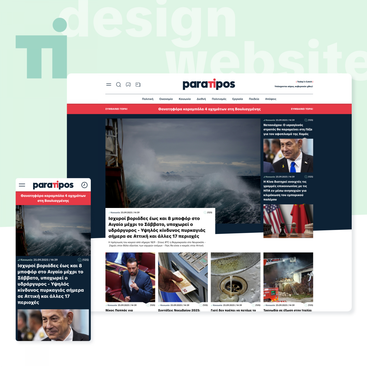
As part of our ongoing work in digital publishing, we designed and developed a contemporary news portal tailored to the needs of a fast-paced information environment. The project focused on delivering a clear, reliable, and efficient reading experience, combining speed with strong editorial structure.
The platform supports continuous news flow, covering current affairs, opinion, and political insights, including behind-the-scenes reporting. Content is organized to highlight top stories without allowing a single item to dominate, encouraging users to explore multiple topics and engage with more content.
From a UX perspective, the layout is built around clarity and ease of navigation. Bold headlines and concise teasers help users quickly identify key stories, while a structured hierarchy ensures smooth browsing across sections. The result is an interface that prioritizes immediacy without overwhelming the reader.
The visual identity is based on strong typography and a clean layout system. Content is arranged in distinct zones to improve readability and scanning, while controlled asymmetry adds visual interest and reduces fatigue. Selected dark sections are used to create contrast and emphasize specific content areas.
Imagery follows a flexible system, combining landscape and square formats to support different types of storytelling. Supporting elements, such as icons and subtle geometric shapes, introduce a more approachable tone, while maintaining a professional and editorial character. Lines and occasional vertical typography references add a subtle connection to traditional newspaper layouts.
The color palette is built on black and white contrast, supported by deep blue-grey tones for consistency and credibility. Green accents introduce balance and freshness, while a vivid red with a slight coral tone adds emphasis in key moments.
Typography plays a central role in the interface. The use of TikTok Sans contributes a modern and accessible feel, supporting readability across devices while introducing a contemporary tone aligned with digital media.
The logo follows a minimal and typographic approach, designed for clarity and recognition. Bold letterforms ensure legibility, while the visual separation of the central “ti” creates a subtle point of distinction within an otherwise simple structure.
Overall, the project brings together editorial structure, visual clarity, and user-focused design to create a news platform that is easy to navigate, consistent in tone, and adaptable to a continuous content flow.
Built on Drupal 11, the platform leverages the latest generation of open-source content management technology, delivering enhanced performance, scalability, security, and editorial flexibility. This modern foundation ensures the portal is ready to evolve alongside the demands of contemporary digital journalism.